Introduction
Every year, one color suddenly seems to appear everywhere. It shows up in fashion collections, living rooms, beauty products, packaging, and even social media mood boards. That is exactly what happened with pantone color of the year 2024, a shade that feels soft at first glance but carries a surprisingly strong emotional pull.
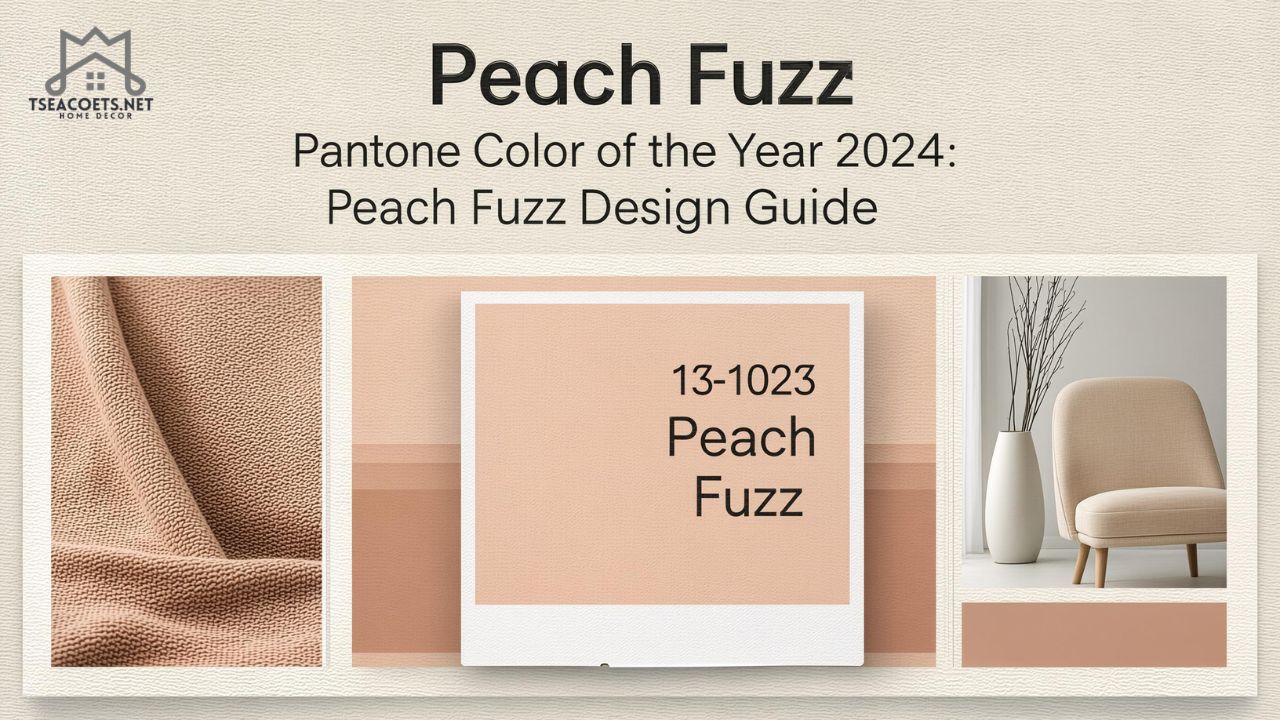
The official pick for pantone color of the year 2024 is PANTONE 13-1023 Peach Fuzz, a gentle peach tone Pantone describes as compassionate, nurturing, and warmly comforting. Pantone introduced it on December 7, 2023, and framed it as a color that reflects the human need for closeness, calm, and care.
What makes this topic matter is simple: color shapes how spaces feel, how brands communicate, and how people respond emotionally. A trend color is never just about aesthetics. In reality, it often reveals what people are craving in a specific moment. Peach Fuzz arrived at a time when many people wanted homes, wardrobes, and digital spaces that felt less harsh and more human.
Instead of treating this as another passing design headline, it helps to ask a better question: why did this particular color resonate so deeply? Once you understand that, it becomes much easier to use it well in your own home, business, or creative work.
What Is pantone color of the year 2024?
Pantone Color of the Year is an annual selection made by the Pantone Color Institute. For 2024, the chosen shade is Peach Fuzz, officially labeled PANTONE 13-1023. Pantone presents it as a velvety, gentle peach that enriches mind, body, and soul. The brand’s official guideline materials also list the digital HEX value as #FFBE98 and sRGB as 255, 190, 152.
That sounds polished, but let’s put it in normal language. Peach Fuzz sits in that sweet spot between pink, apricot, and soft orange. It feels warmer than blush, calmer than coral, and less sugary than a typical pastel peach. That balance is what gives it range. It can look elegant, modern, cozy, playful, or romantic depending on how you use it.
This is also not a random selection pulled out of a trend hat. Pantone’s annual choice is designed to reflect cultural mood and global behavior. The company has long tied its picks to shifts in design, lifestyle, technology, and public emotion. In that sense, pantone color of the year 2024 tells a story about softness becoming a strength.
Why Peach Fuzz Became the Color of 2024
Trends do not appear in a vacuum. They rise because they answer something people are already feeling. Peach Fuzz landed in a world full of visual noise, overstimulation, burnout, and constant digital pressure. Against that backdrop, a tender peach feels almost like a quiet exhale.
Pantone itself linked the 2024 choice to nurturance, empathy, and the desire to care for ourselves and others. That message explains a lot. Many recent design trends leaned into warmth, comfort, and emotional safety rather than sharp minimalism or cold perfection. Peach Fuzz fits that shift beautifully.
There is also a practical reason this color caught on. It is highly versatile. A bold trend color can feel exciting on a runway and impossible in a real home. Peach Fuzz is different. It works in bedrooms, branding, packaging, sweaters, lipstick, ceramics, floral design, and social content. It is trend-driven, but still livable.
Designers often look for colors that feel fresh without alienating people. That is where Peach Fuzz wins. It is recognizable enough to feel current, yet soft enough to appeal to people who normally avoid trend-led choices.
The Meaning Behind Peach Fuzz
Color psychology is not magic, but it does influence perception. People respond to colors emotionally before they analyze them logically. Peach tones often signal warmth, openness, affection, and ease. They can soften a room, make a product feel more approachable, or add a touch of human warmth to a very clean design system.
With pantone color of the year 2024, the emotional angle is central. Pantone describes Peach Fuzz as a compassionate and nurturing soft peach shade, and that wording matters. The brand was not selling drama. It was selling reassurance.
Here is what Peach Fuzz tends to communicate in real settings:
- Warmth without heaviness
- Gentleness without looking childish
- Optimism without looking loud
- Romance without becoming overly sweet
- Comfort without feeling boring
That said, color meaning always depends on context. In a luxury setting, Peach Fuzz can feel refined and intimate. In a wellness brand, it can feel healing and calm. In a youth-focused campaign, it can feel playful and fresh. The shade stays the same, but the emotional reading changes with styling, lighting, typography, and surrounding colors.
Peach Fuzz Color Codes and Technical Details
When a color trend enters actual design work, feelings alone are not enough. Designers need usable codes and practical translation across print, digital, textiles, and interiors.
Pantone’s official materials identify the 2024 shade as:
- Color name: PANTONE 13-1023 Peach Fuzz
- HEX: #FFBE98
- sRGB: 255, 190, 152
- L*a*b*: 84, 22, 30
These details matter because Peach Fuzz can look slightly different depending on the medium. On a phone screen, it may appear brighter and more pink. On matte paint, it may feel more muted and earthy. On fabric, especially velvet, linen, or brushed cotton, it can take on a richer and softer personality.
How to match Peach Fuzz accurately
If you are working across platforms, keep these points in mind:
- Test the shade in natural and artificial light
- Compare screen color with printed samples
- Use texture carefully, because texture changes perceived warmth
- Pair it with balanced neutrals so it does not turn too sugary
- Avoid assuming one digital mockup will match the final physical product
For everyday users, the lesson is simple: swatches matter. A peach wall sample can look dreamy in morning light and surprisingly orange by evening.
How pantone color of the year 2024 Works in Interior Design
This is where Peach Fuzz becomes genuinely useful. In homes, it offers warmth without the weight of deep brown or rust. It adds personality without the intensity of bright coral. It also plays well with many existing materials, including oak, walnut, brushed brass, natural stone, boucle, linen, and matte ceramics.
Living rooms
In living spaces, Peach Fuzz works best as a soft accent or a subtle wash of color. A sofa, throw blanket, accent chair, or art print can bring the tone in without taking over. If your room already has beige, cream, warm white, or wood tones, the color slips in naturally.
A real-life example: imagine a small apartment living room with off-white walls, a taupe rug, a walnut coffee table, and black metal lighting. Add Peach Fuzz cushions and one textured throw, and the whole room suddenly feels more welcoming. The change is small, but the mood shifts immediately.
Bedrooms
Bedrooms are probably the easiest place to use this trend. Peach Fuzz naturally suits spaces meant for rest. Use it in bedding, curtains, upholstered headboards, or a soft feature wall. It brings emotional warmth without making the room feel hot or visually crowded.
Kitchens and dining areas
This is where people get nervous, but it can work beautifully. Think less “peach everywhere” and more thoughtful detail:
- Peach-toned table linens
- Ceramic vases or bowls
- Upholstered dining chairs
- Artwork with apricot and blush undertones
- Small appliances or accessories in a warm peach palette
Bathrooms
In bathrooms, Peach Fuzz can feel spa-like, especially when paired with soft white, sand, or light stone. Towels, bath mats, candles, and vanity accessories offer low-risk ways to try it.
Image suggestion 2: Room mood board showing Peach Fuzz used in a bedroom, living room, and bathroom.
How to Use pantone color of the year 2024 Without Overdoing It
A beautiful color becomes a bad trend when people push it too far. Peach Fuzz is forgiving, but it still needs balance.
Start with one layer
If you are unsure, bring it in through one category only:
- Textiles
- Accessories
- Wall art
- Table styling
- Flowers
- Small decor pieces
Once you see how the color behaves in your space, you can build from there.
Use contrast wisely
Peach Fuzz shines when it has something to push against. Too much of it can make a room or outfit feel washed out. Pairing it with contrast creates shape.
Good contrast partners include:
- Espresso brown
- Olive green
- Charcoal
- Deep navy
- Terracotta
- Warm ivory
Let texture do some of the work
A flat peach surface can sometimes feel bland. Texture fixes that. Boucle, velvet, matte plaster, woven cotton, ribbed glass, and handmade ceramics all help the color feel layered and intentional.
How to Wear Peach Fuzz in Fashion and Beauty
Peach Fuzz is one of those rare trend shades that can move from interiors to personal style without losing its charm. It works especially well because it flatters a wide range of skin tones when adjusted through fabric depth, makeup undertones, and styling.
Clothing ideas
Some easy ways to wear it:
- A soft knit sweater with white denim
- A satin blouse with tailored trousers
- A summer dress with tan sandals
- A peach scarf under a camel coat
- Peach sneakers or a bag as a subtle accent
For people who avoid color, start small. A scarf, manicure, lip color, or handbag can be enough.
Beauty and makeup
Peach tones are already familiar in beauty, which made the 2024 color even easier to adopt. Peach blush, nude-peach lipstick, glossy apricot nails, and warm cream eyeshadows all fit naturally into everyday routines.
The reason it works is emotional as much as visual. Peach reads as healthy, fresh, and approachable. It brightens without shouting.
Using Peach Fuzz in Branding and Marketing
Brands love colors that create instant feeling, and Peach Fuzz does exactly that. It can soften hard-edged industries, make wellness brands feel more human, or add warmth to beauty and lifestyle packaging.
Best industries for Peach Fuzz branding
This shade works particularly well for:
- Beauty and skincare
- Wellness and self-care
- Home decor
- Baby and family products
- Hospitality
- Lifestyle brands
- Boutique food and beverage packaging
What Peach Fuzz communicates in branding
Used well, it can signal:
- Comfort
- Kindness
- Approachability
- Care
- Soft luxury
- Emotional connection
However, not every brand should rush into it. A cyber-security firm, a heavy machinery manufacturer, or a legal service brand may find Peach Fuzz too gentle unless it is used in a very limited supporting role.
Quick branding tip
If you want a brand to feel warmer without losing clarity, use Peach Fuzz as a secondary accent rather than the main identity color. That often gives you the emotional benefit without weakening the brand’s core authority.
Best Color Combinations With Peach Fuzz
Peach Fuzz gets much stronger when paired with the right supporting palette. Alone, it is gentle. In combination, it becomes sophisticated.
Soft and calm palette
- Peach Fuzz
- Warm white
- Sand
- Oatmeal
- Pale beige
Best for bedrooms, spas, wellness brands, and feminine editorial design.
Earthy modern palette
- Peach Fuzz
- Terracotta
- Clay
- Olive
- Walnut brown
Best for grounded interiors, artisan brands, and warm contemporary spaces.
Elegant contrast palette
- Peach Fuzz
- Charcoal
- Black accents
- Brass
- Cream
Best for luxury branding, dining rooms, statement styling, and fashion.
Fresh natural palette
- Peach Fuzz
- Sage green
- Dusty rose
- Linen
- Light wood
Best for spring styling, calm living rooms, wedding design, and visual content.
Mistakes to Avoid When Decorating With Peach Fuzz
Trends go wrong when people copy the color but ignore the context. Here are the most common mistakes.
1. Using too many similar pastel tones
When everything is soft, nothing stands out. Rooms can end up feeling faded instead of styled.
2. Ignoring undertones
Some peach shades lean pink, others lean orange. If surrounding colors clash, the result feels off immediately.
3. Forgetting lighting
Peach Fuzz changes dramatically in warm versus cool light. Always test samples before committing.
4. Using glossy finishes everywhere
Too much shine can make the color feel artificial. Matte or textured finishes usually look richer.
5. Treating it as a forever neutral
Peach Fuzz is adaptable, but it is still a color statement. Use it intentionally.
Personal Background and Career Journey of the Pantone Color of the Year Program
Since you asked for a personal background or career-style section if relevant, the most meaningful fit here is not an individual net worth profile. It is the story of the Pantone Color of the Year program itself.
Pantone introduced the Color of the Year program in 1999, beginning with Cerulean Blue for the year 2000. In the 2024 press release, Pantone noted that Peach Fuzz marks the program’s 25th anniversary. Over time, what began as a color forecast evolved into a major cultural signal watched by designers, marketers, retailers, and media outlets around the world.
Career journey of the program
The growth of the program happened in stages:
- Industry credibility phase
It began as a design-led forecast rooted in Pantone’s color authority. - Media expansion phase
As fashion, interiors, and branding publications started covering the choice every year, public awareness grew. - Consumer influence phase
The annual color stopped being only for professionals and became something everyday consumers cared about. - Collaboration phase
Pantone expanded the idea into partnerships, product releases, and lifestyle activations. For 2024, the brand highlighted collaborations tied to Peach Fuzz.
Achievements
The program’s major achievement is simple but powerful: it turned color forecasting into a mainstream cultural event. Very few design systems have achieved that level of visibility.
Financial insights
Pantone does not present the Color of the Year like a celebrity profile, so there is no sensible or reliable “net worth” figure to attach to the program itself here. The better financial takeaway is this: the annual selection has clear commercial influence across product development, licensing, brand campaigns, retail merchandising, and trend-led content. That influence is one reason each yearly reveal gets such wide coverage.
Why This Color Still Matters Beyond 2024
Some trend colors disappear the moment the calendar changes. Peach Fuzz has a better chance than most of staying relevant because it is emotionally useful, not just visually timely.
Warm, soft shades tend to return whenever people want comfort, intimacy, and ease in their spaces. That means Peach Fuzz may stop being “the trend color” at some point, but the logic behind its popularity will remain. People rarely get tired of colors that make spaces feel kinder.
This is the deeper reason pantone color of the year 2024 became such a strong talking point. It was not just pretty. It answered a real emotional mood.
FAQ
What is pantone color of the year 2024?
Pantone color of the year 2024 is PANTONE 13-1023 Peach Fuzz, a soft peach shade chosen by the Pantone Color Institute.
What does Peach Fuzz symbolize?
Peach Fuzz is associated with warmth, compassion, comfort, and human connection. Pantone specifically describes it as nurturing and gentle.
Is Peach Fuzz more pink or orange?
It sits between pink and orange, but most people read it as a soft, warm peach with a balanced undertone.
What is the HEX code for Peach Fuzz?
Pantone’s official guideline materials list Peach Fuzz with the HEX value #FFBE98.
Can Peach Fuzz work in modern interiors?
Yes. It works especially well with warm neutrals, wood textures, brass, olive, charcoal, and soft white, which helps it feel modern rather than overly sweet.
Is Peach Fuzz a good brand color?
It can be excellent for beauty, wellness, lifestyle, decor, and hospitality brands. It tends to feel caring and approachable.
Does Peach Fuzz suit all seasons?
Yes, but it shifts slightly by season. In spring and summer, it feels airy and fresh. In autumn and winter, it feels cozy when paired with deeper earthy tones.
Is Peach Fuzz hard to decorate with?
Not really. It is easier than bold trend colors because it behaves almost like a warm neutral when used in moderation.
Conclusion
Pantone did not choose Peach Fuzz by accident. The shade captured a cultural mood that valued softness, care, warmth, and emotional ease. That is why pantone color of the year 2024 felt bigger than a simple color announcement.
Whether you are updating a room, planning a visual brand, refreshing your wardrobe, or just trying to understand why this peach tone suddenly seemed everywhere, Peach Fuzz makes sense because it feels human. And honestly, that may be the most powerful design trend of all.