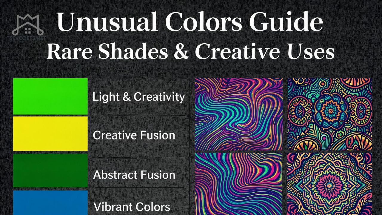
Introduction
Color is everywhere—but not all colors are created equal. Some shades quietly blend into the background, while others stop you in your tracks. That’s the magic of unusual colors. They feel rare, intriguing, and sometimes even a little mysterious.
If you’ve ever noticed a shade you couldn’t quite name or felt drawn to a color that seemed “different,” you’ve already experienced the pull of unusual colors. These hues matter more than we realize—they influence mood, creativity, branding, and even how we express ourselves.
In a world flooded with predictable palettes, unusual colors offer something refreshing: originality. Whether you’re a designer, artist, or simply someone who loves aesthetics, understanding these colors can completely transform how you see and use color.


What Are Unusual Colors?
At their core, unusual colors are shades that fall outside the typical or commonly recognized spectrum. They may be rare, hard to describe, or combinations that don’t appear often in everyday life.
Definition
Unusual colors are:
- Rare or uncommon hues
- Complex blends of multiple tones
- Shades with unique undertones or light interactions
- Colors that don’t have widely known names
Think of colors like:
- Chartreuse (between green and yellow)
- Tyrian purple (historically rare and expensive)
- Vantablack (absorbs nearly all light)
- Glaucous (a muted bluish-gray tone)
These shades stand apart because they challenge our expectations.
Why They Feel So Unique
Our brains are wired to recognize familiar patterns. When we encounter a color that doesn’t fit neatly into a category, it creates curiosity—and sometimes even fascination.
That’s why <strong>unusual colors</strong> often feel more “premium,” artistic, or memorable.
Why Unusual Colors Matter in Modern Design
In today’s saturated digital world, standing out is harder than ever. Designers, brands, and creators are constantly searching for ways to differentiate themselves—and color plays a huge role.
1. They Capture Attention Instantly
Bright reds and blues are everywhere. But a muted teal with gray undertones? That’s something people pause to notice.
2. They Create Emotional Depth
Unusual colors often carry complex emotional signals:
- A dusty lavender can feel nostalgic
- A greenish-gray can feel calm yet mysterious
- An iridescent tone can feel futuristic
3. They Enhance Brand Identity
Brands that use unusual colors tend to be more memorable. Think of how certain companies use unexpected palettes to stand out in crowded markets.
4. They Encourage Creativity
When you move beyond standard colors, you’re forced to think differently. That’s where innovation begins.
Types of Unusual Colors You Should Know
Rare Natural Shades
These are colors found in nature but not commonly seen:
- Bioluminescent blues
- Deep ocean greens
- Iridescent insect hues
Synthetic or Engineered Colors
Some colors are created through science:
- Ultra-pure pigments
- Light-absorbing materials like Vantablack
- Digital-only RGB combinations
Hybrid Colors
These are blends that don’t fit neatly into categories:
- Blue-green-gray mixes
- Pinkish-beige tones
- Warm-cool hybrids
Obscure Named Colors
Some unusual colors are defined more by language than by rarity:
- “Smalt”
- “Zaffre”
- “Coquelicot”
These names alone add intrigue and uniqueness.
Color Psychology Behind Unusual Colors
Color psychology becomes even more fascinating when we talk about unusual colors.
Emotional Impact
Unusual colors often trigger:
- Curiosity
- Calmness (in muted tones)
- Excitement (in vibrant blends)
- Mystery (in dark or ambiguous hues)
Cognitive Response
Because they’re unfamiliar, unusual colors:
- Require more mental processing
- Stay longer in memory
- Create stronger impressions
Examples
| Color Type | Emotional Effect |
|---|---|
| Muted teal | Calm, introspective |
| Dusty rose | Nostalgic, romantic |
| Neon coral | Energetic, playful |
| Deep indigo | Mysterious, intellectual |
How to Use Unusual Colors Effectively
Using unusual colors can elevate your work—but only if done right.
1. Start Small
If you’re new to them:
- Use them as accents
- Add them to highlights or backgrounds
- Pair with neutral tones
2. Balance Is Key
Too many unusual colors can feel chaotic.
Instead:
- Combine one unusual color with 2–3 standard tones
- Use contrast wisely
3. Understand Context
A color that works in fashion may not work in web design.
Ask yourself:
- Where will this color be used?
- What emotion should it convey?
4. Test Before Finalizing
Colors can look different depending on:
- Lighting
- Screen type
- Material
Always test variations before committing.
Unusual Colors in Fashion and Branding
Fashion
Designers often use unusual colors to:
- Create signature looks
- Set trends
- Express individuality
Examples include:
- Iridescent fabrics
- Muted pastel combinations
- Unexpected color blocking
Branding
Brands use unusual colors to:
- Stand out in crowded industries
- Build unique identities
- Evoke specific emotions
For instance:
- Tech brands may use futuristic tones
- Luxury brands may use rare, deep hues
Real-Life Example
A startup using a soft gray-lilac instead of standard blue can instantly feel more modern and creative.
Rare Colors in Nature That Inspire Creativity
Nature is one of the richest sources of unusual colors.

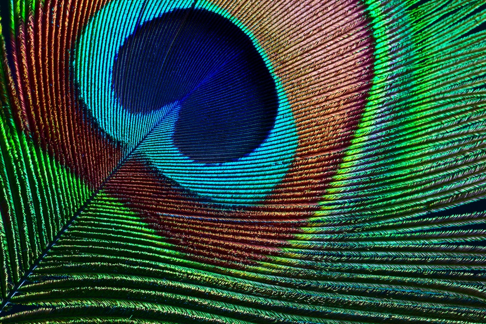
Examples
- Aurora Borealis: Shifting greens, purples, and reds
- Peacock feathers: Iridescent blues and greens
- Deep-sea creatures: Neon-like bioluminescence
- Rare flowers: Unusual purples, blacks, and blues
Why Nature Matters
Nature’s palette is:
- Complex
- Balanced
- Emotionally resonant
Studying it can inspire more authentic use of unusual colors.
Personal Background: Designers Who Popularized Unusual Colors
While unusual colors exist naturally, their widespread use in modern design is largely thanks to visionary creators.
Career Journeys
Many influential designers started with traditional palettes but shifted toward unique color experimentation:
- Exploring digital tools
- Studying color theory deeply
- Drawing inspiration from global cultures
Achievements
These designers:
- Redefined branding aesthetics
- Introduced unconventional palettes into mainstream design
- Influenced fashion, UI/UX, and advertising
Financial Insights
Top designers and creative directors who successfully leveraged unusual colors in branding and fashion often earn:
- Six-figure annual incomes
- Multi-million dollar brand valuations
- High consulting fees due to their unique visual style
Their success shows that mastering unusual colors isn’t just artistic—it can be financially rewarding.
Advanced Tips for Mastering Unusual Colors
Use Color Tools
Tools like:
- Color pickers
- Palette generators
- Gradient creators
Help refine unusual shades.
Study Lighting Effects
Lighting can dramatically change how a color appears:
- Warm light enhances reds and oranges
- Cool light emphasizes blues and greens
Combine Texture with Color
Sometimes, it’s not just the color—but how it interacts with surfaces:
- Matte vs glossy
- Metallic finishes
- Transparent layers
Common Mistakes to Avoid
- Overusing unusual colors without balance
- Ignoring contrast and readability
- Choosing colors based on trend rather than purpose
- Not testing colors in real-world settings
FAQs
What makes a color “unusual”?
An unusual color is one that is rare, complex, or not commonly used. It often includes unique blends or undertones that make it stand out.
Are unusual colors better for branding?
They can be, especially if used strategically. They help brands stand out and create memorable identities.
Can unusual colors affect mood?
Yes, they often create stronger emotional responses because they are less familiar and more intriguing.
How do I find unusual colors?
Explore nature, digital tools, and art references. Many palette generators also suggest unique combinations.
Are unusual colors hard to use?
Not necessarily. With balance and understanding, they can be incredibly effective.
Do unusual colors work in minimalist design?
Yes, a single unusual color can enhance minimalism by adding depth and focus.
Why are unusual colors trending?
Because people are seeking originality and uniqueness in a visually saturated world.
Can unusual colors improve creativity?
Absolutely. They challenge conventional thinking and inspire new ideas.
Conclusion
Unusual colors aren’t just visually interesting—they’re powerful tools for expression, creativity, and differentiation. In a world where everything can start to feel the same, these colors offer a way to stand out without saying a word.
Whether you’re designing a brand, choosing an outfit, or simply exploring your creative side, embracing unusual colors can open up a completely new perspective. And once you start noticing them, you’ll realize—they’ve been quietly shaping the world around you all along.